BitWindow Document
Introduction
BitWindow is a component developed using pure JavaScript and CSS to create draggable pop-up windows in both web and mobile environments. It supports various configuration options, enabling developers to easily and quickly create JavaScript windows.
Demo
For more information about BitWindow, please refer to the demo site below. You can easily explore the window's features without complex explanations through the control panel page.
www.bit-stack.com/bit-window/demo/control-panel.html
Feature
The BitWindow is mainly divided into a header area and a contents area. The contents area is the section that the developer creates to provide to the user, while the header area displays the window's header. Since the BitWindow automatically generates the header area, the developer can easily add it through a few options.
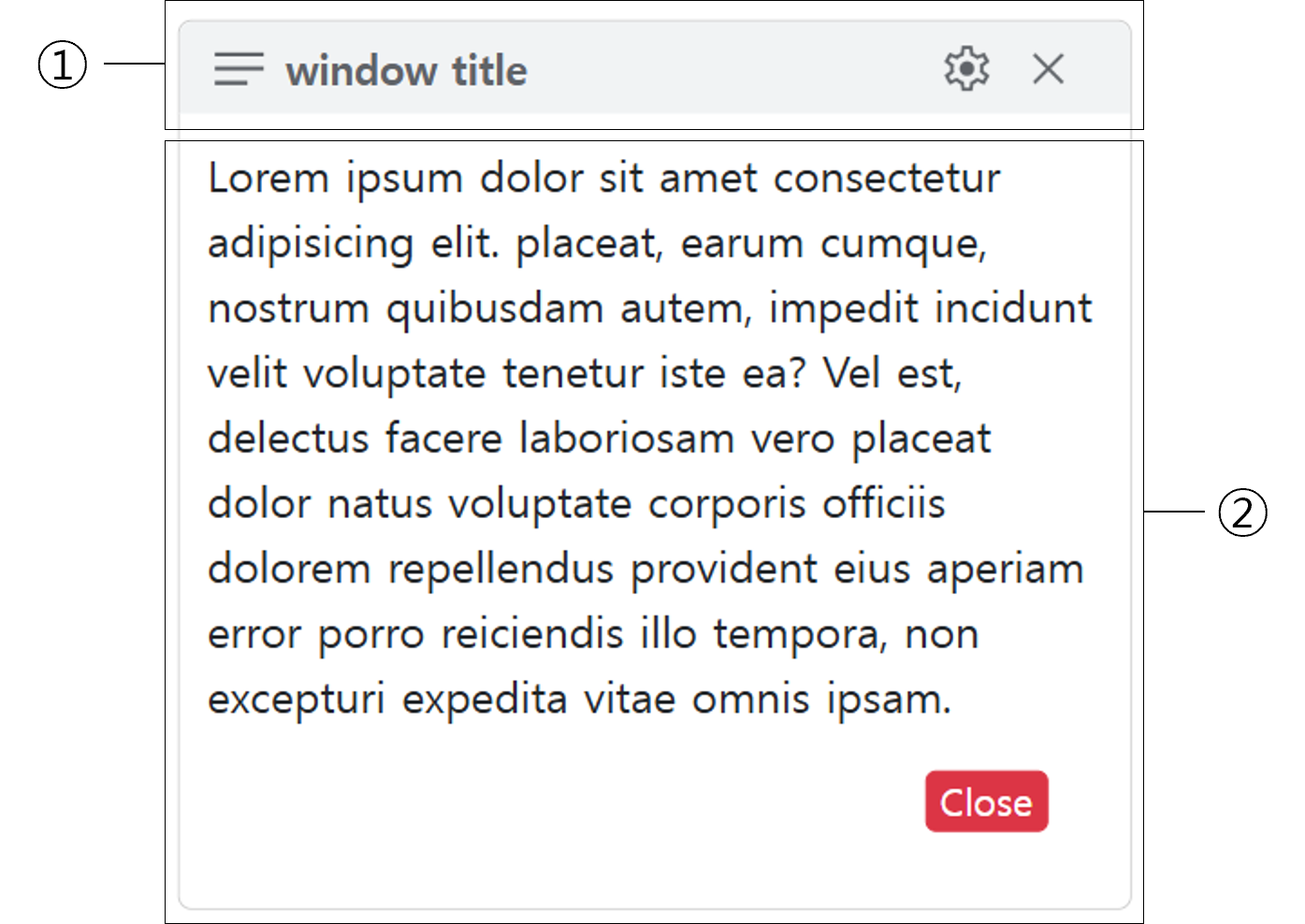
- Header Area : Specify the header icon, title, and actions to close the window or perform additional tasks with icons.
- Contents Area : Window Contests
Install
- Download the project.
- Copy the
bit-window.min.cssandbit-window.min.jsfiles from thedistfolder to your desired location. - Place the CSS and JS files in the appropriate sections of the
<head>and<body>of your HTML. - Implement the internal functionality of the window and assign the desired
idto the respective area. - To hide the window when the page loads, add the
bw-windowclass to the element.
                <link rel="stylesheet" type="text/css" href="dist/bit-snackbar.min.css" />
                <script type="text/javascript" src="dist/bit-snackbar.min.js"></script>
                <div id="window1" class="bw-window">
                ...
                </div>
Quick Start
BitWindow automatically adds the window's header section through option settings. Using global options and header options, users can configure the window's functionality as desired. Before diving into the specific options for each section, you can quickly and easily implement a pop-up window in typical scenarios using the predefined features of BitWindow, as shown in the example below.
BitWindow.show({target:'window1'});
By using the BitWindow.show feature, a window is created with an automatically added header that includes a notes icon and a close icon. When the close icon is clicked or when the user clicks outside the window, the window will automatically disappear.
| Name | Control |
|---|---|
| Default Window |
Options
Syntex
Options are set by connecting the option name and option value with a : inside {} (e.g., {option-name: option-value}). Multiple options can be used consecutively by separating them with a ,. The configured options can then be applied by passing them as arguments to the BitWindow.show() function.
The target option is required and must be specified.
BitWindow.show({target:'window1', isModal:false, headerLabel:'Information'})
Global Options
The global options determine the basic behavior of BitWindow. With the global options, you can set the window's position, enable or disable dragging, and hide the header section.
| Name | Type | Default | Control | Descriptions |
|---|---|---|---|---|
| target | string | null | The ID of the window element to be displayed on the screen. | |
| position | string | center | `center` or `around`. When set to `around`, the window will be positioned at the top-left of the clicked location. However, if the window extends beyond the left edge of the screen, it will automatically be positioned at the top-right instead. | |
| clickEvent | event | null | This is a required value when the position is set to `around`. It refers to the user's click event. | |
| isModal | boolean | true | Whether the window is modal. | |
| isDrag | boolean | true | Whether the window is draggable. If set to `false`, the window cannot be dragged. | |
| showHeader | boolean | true | Whether to display the header. If set to `false`, only the specified element will be shown as the window, without the header. | |
| cornerRadius | string | 5px | The corner radius value of the window. |
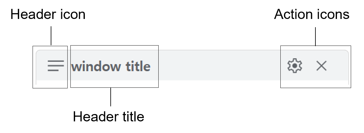
Header Options(Left Side Label)
The header area is located at the top of the window and displays the window's title as text or an icon. It also supports interaction with the user through buttons to close the window or handle specific events defined by the user. In BitWindow, the header is created automatically and is included by default. If you don't want to include the header, you can specify the showHeader: false option.
The options used in the header area are as follows:
| Name | Type | Default | Control | Descriptions |
|---|---|---|---|---|
| headerColor | string | #f1f3f4 | The background color of the header area. You can apply colors in formats such as hex, rgb, etc. | |
| headerlcon | string | notes | The built-in icon displayed on the left side of the header. There are 10 built-in icons: arrow_down, close, danger, info, menu, notes, question, setting, success, and warning. For the four icons — info, success, warn, and danger — you can append _colored (e.g., `info_colored`) to insert predefined colored versions of the icons. |
|
| headerLabel | string | null | The text displayed on the left side of the header. | |
| headerLabelColor | string | #5f6368 | The color of the header label. You can apply colors in formats such as hex, rgb, etc. |
Header Option(Right Side Actions)
The action icon is located on the right side of the header and responds to BitWindow.close() or a user-defined function. BitWindow does not limit the number of actions. If there is only one action, you can define it as shown in the example below, where the icon to be displayed and the function to be executed when clicked are specified inside the {}. The icon is the same as the one defined in the previous section under the headerIcon option.
BitWindow.show({target:'window1', actions:{icon: 'close', function:()=>BitWindow.close()}})
If you want to use more than one action, place all the actions inside [] and separate each action with a ,.
                    BitWindow.show({target:'window1', actions:[{icon:'setting', function:()=>alert('Do Action!!')},
                                                               {icon: 'close', function:()=>BitWindow.close()}]})
| Name | Type | Default | Control | Descriptions |
|---|---|---|---|---|
| actions | object | close | There are 10 built-in icons: arrow_down, close, danger, info, menu, notes, question, setting, success, and warning. For the four icons — info, success, warn, and danger — you can append _colored (e.g., `info_colored`) to insert predefined colored versions of the icons. |
Event
Using the BitWindow.close() event, you can close the window that is displayed on the screen.
BitWindow.show({target:'window1', actions:{icon: 'close', function:()=>BitWindow.close()}})
| Name | Type | Default | Control | Descriptions |
|---|---|---|---|---|
| BitWindow.close() | function | - | Close the window that is displayed on the screen |