BitSnackbar Document
Introduction
The BitSnackbar is a message component developed using pure JavaScript and CSS, designed to provide more suitable notification functionality for users by adding various options based on the traditional snackbar format.
Demo
You can quickly see the functionality of the snackbar through the control panel page without complex explanations.
www.bit-stack.com/bit-snackbar/demo/control-panel.html
Feature
The BitSnackbar is divided into three areas: header, message, and action, allowing users to configure the snackbar's functionality through options for each area.
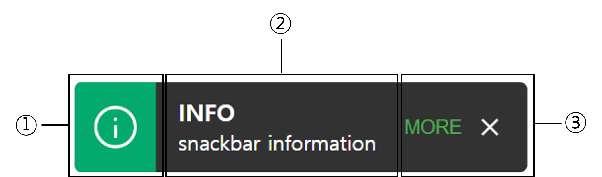
- Header Area : Convey messages to users through text, icons, and background colors.
- Message Area : Display messages in text form. It can include a title and a main message.
- Action Area : Help user interaction through buttons or text
Install
- Download the project.
- Copy the bit-snackbar.css and bit-snackbar.js files from the dist folder to your desired location.
- Place the CSS and JS files appropriately in the head and body sections for use.
                <link rel="stylesheet" type="text/css" href="dist/bit-snackbar.min.css" />
                <script type="text/javascript" src="dist/bit-snackbar.min.js"></script>
Quick Start
Before taking a closer look at the specific options of snackbar's each area, you can easily and quickly implement notification functionality in typical situations using the predefined features of the BitSnackbar, as shown in the example below.
                BitSnackbar.tiny({message:'BitSnackbar message example', position:'top-center'});
                BitSnackbar.info({message:'BitSnackbar message example', position:'top-center'});
                BitSnackbar.success({message:'BitSnackbar message example', position:'top-center'});
                BitSnackbar.warning({message:'BitSnackbar message example', position:'top-center'});
                BitSnackbar.danger({message:'BitSnackbar message example', position:'top-center'});
In this case, the message must be provided, and if the position is not specified, it will default to top-center. If no message is entered, the snackbar will display the default message, No Message.
| Name | Control |
|---|---|
| Default Snackbar | |
| Built-in Snackbar |
Options
Syntex
Options are set using the format {option-name:option-value} by connecting the option name and value with a : inside the {}. You can use , to apply multiple options in succession. The configured option values can be passed as arguments to the BitSnackbar.show() function to apply the options. Additionally, the basic functions introduced in the previous paragraph, such as tiny() and info(), can also apply the desired options.
BitSnackbar.show({showHeader:true, headerColor:'info', headerIcon:'info'})
Global Options
Global options are settings that determine the basic behavior of the BitSnackbar. In the global options, you can configure the background color and position of the snackbar, as well as hide the header and action areas.
| Name | Type | Default | Control | Descriptions |
|---|---|---|---|---|
| bgColor | string | #323232 | Snackbar background color. Color options such as hex and rgb | |
| position | string | top-center | Combinations of top or bottom with left, right, or center values to set the snackbar's position. eg. top-center, bottom-right | |
| opacity | number | 1 | Snackbar opacity. Decimal values between 0 and 1 | |
| margin | string | 10px | Snackbar margin. px, Size elements like px, em, rem | |
| width | string | auto | Snackbar width. On screens larger than 640px, the max width is set to 568px. | |
| duration | number | 3500 | Snackbar presentation time on the screen. 1000 = 1s | |
| autoHide | boolean | true | Snackbar presentation time on the screen. 1000 = 1s | |
| showHeader | boolean | false | Visibility of the header area | |
| showAction | boolean | true | Visibility of the header area |
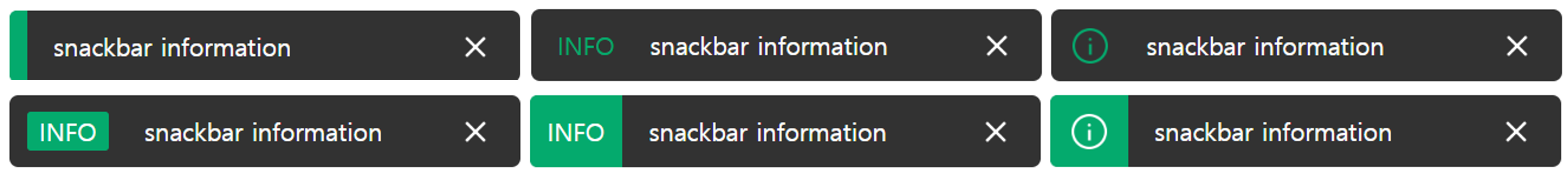
Header Options
The header area conveys the message through color and icons. By default, the snackbar does not include a header. To include a header, you must specify the showHeader: true option. The options used in the header area are as follows.
| Name | Type | Default | Control | Descriptions |
|---|---|---|---|---|
| headerColor | string | null | Background color of the header area Four predefined colors: info, success, warning, and danger Additionally, colors such as hex and rgb can be applied. |
|
| headerLabel | string | null | Text to be displayed in the header | |
| headerLabelColor | string | #FFFFFF | Header label color Four predefined colors: info, success, warning, and danger Additionally, colors such as hex and rgb can be applied. |
|
| headerLabelBgColor | string | null | Background color of the header label Four predefined colors: info, success, warning, and danger Additionally, colors such as hex and rgb can be applied. |
|
| headerlcon | string | null | Built-in icons displayed in the header area. There are five icons: info, success, warning, danger and question. By adding '_colored' (e.g., info_colored), you can insert icons in predefined colors except the question button. The default icons without color are white. |
Message Options
The message area displays the message in text form. Depending on the situation, a title can be included. To include a title, you need to input the title option. By default, the title is not included, and its initial value is null.
| Name | Type | Default | Control | Descriptions |
|---|---|---|---|---|
| title | string | null | Title text. The default setting is not to display. | |
| titleFontColor | string | #FFFFFF | Colors such as hex and rgb can be applied. | |
| titleFontSize | string | 16px | Size elements like px, em, rem | |
| titleAlign | string | left | Title horizontal alignment. There are three options: left, center, and right | |
| message | string | No Message | Main snackbar message. | |
| messageFontColor | string | #FFFFFF | Colors such as hex and rgb can be applied. | |
| messageFontSize | string | 14px | Size elements like px, em, rem | |
| messageAlign | string | left | Message horizontal alignment. There are three options: left, center, and right. |
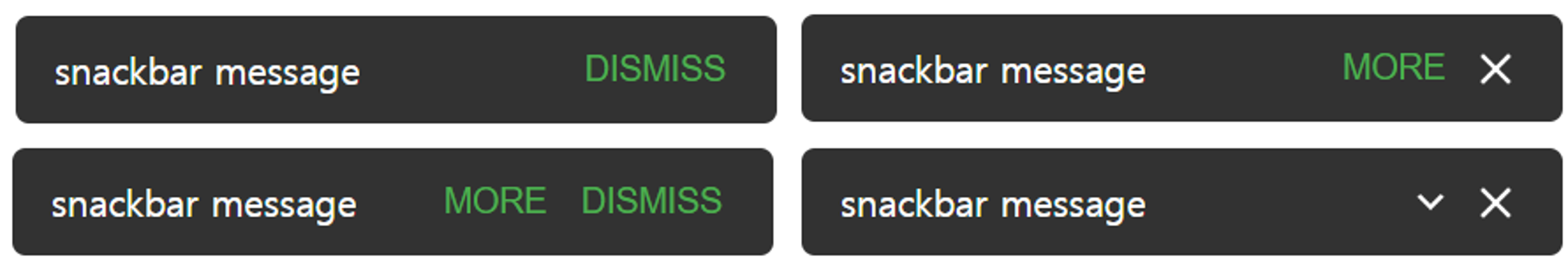
Action Options
The action area supports user interaction through buttons or text, allowing users to close the snackbar or handle specific events designated by them. In a typical snackbar, the number of actions is usually limited to two or fewer; however, the BitSnackbar does not impose any limits on the number of actions.
If there is only one action, as shown in the example below, specify the icon or text to be displayed, along with the function to execute when the user clicks it.
                    {label:'ACTION', function:()=>alert('Action Function')} or
                    {icon: 'close', function:()=>alert('ACTION Function')}
If you want to use two or more actions, place all the actions inside [] and connect each action using a ,
                    [ {label:'ACTION', function:()=>alert('Action Function')},
                    {icon: 'close', function:()=>alert('ACTION Function')} ]
The items that will be configured to execute the action are as follows. When using a label, you can additionally specify the color and font size of the label. The color and font size options do not apply to icons.
| Name | Type | Default | Control | Descriptions |
|---|---|---|---|---|
| icon | string | close | Two built-in icons are available: close and arrow_down. | |
| label | string | null | Action label. | |
| color | string | #4caf50 | Action label font color. Colors such as hex and rgb can be applied. | |
| fontSize | string | inherit | Action label font size. Size elements like px, em, rem |
Event
You can use the onClose event to define an event that will execute after the BitSnackbar has closed (disappeared from the screen).
Below is an example that shows a simple alert box after the snackbar closes.
Snackbar.show({message:'onClose option demo', onClose:()=>alert('AFTER CLOSE ACTION')})
| Name | Type | Default | Control | Descriptions |
|---|---|---|---|---|
| onClose | function | null | Event will execute after the BitSnackbar has closed (disappeared from the screen). |